The eReaders
To make it easy for both grade school and higher ed students to interact with digital classroom materials required separate eReader interfaces designed with a laser focus on usability. The result: easy adoption by a broad customer base.
Challenge
XanEdu needed to modernize its dependable, but aging, web-based eReader. The responsive design we’d implemented years prior had successfully served both Higher Ed and corporate Learning and Development audiences. In addition to being updated, the app needed to serve a K-12 audience, requiring us to pay special attention to the accessibility and usability needs of younger users. Adding to the challenge, we had a small team, a tight budget and competing priorities.
Solution
As lead UX designer for the project, and a Technical Product Manager, I redesigned the K-12 and Higher Ed readers while also participating in roadmap planning and project management. Due to our small team size and competing priorities, this was a multi-year project during which I facilitated collaboration with diverse stakeholders to ensure a smooth process.
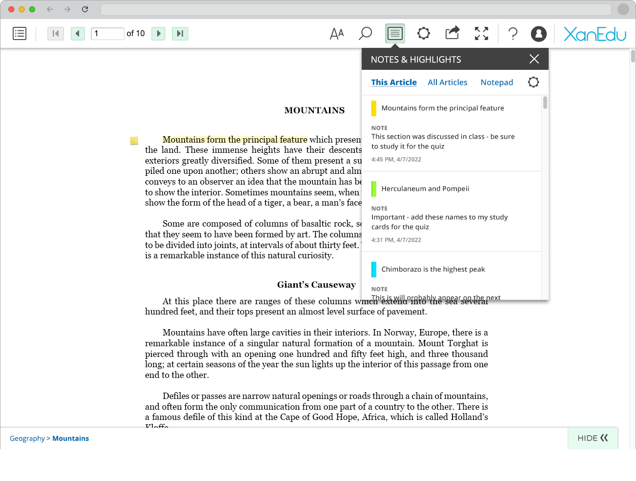
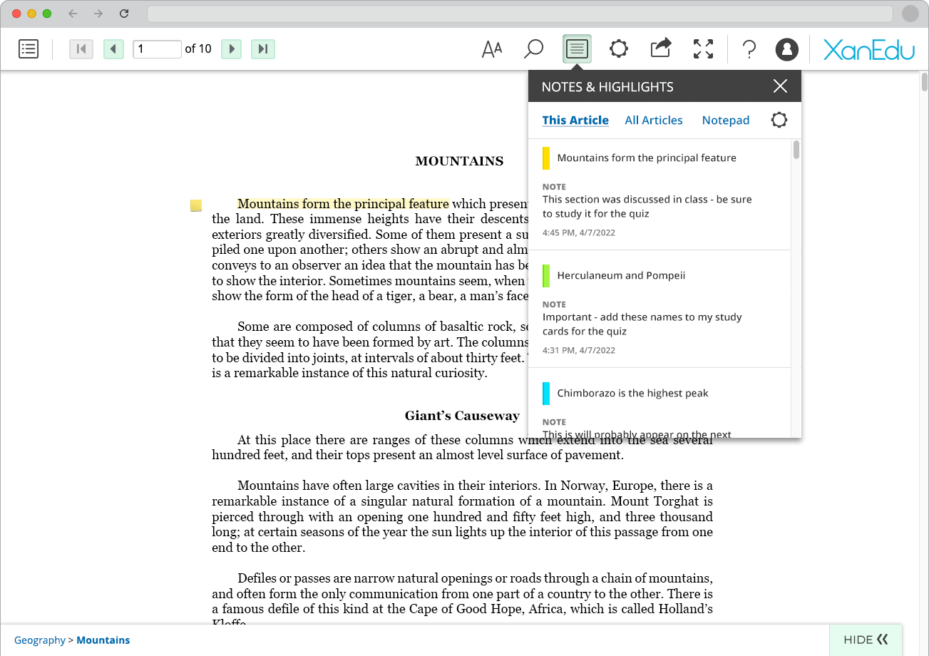
To best serve our higher ed and grade school learners—we worked with an accessibility consultant who helped us prioritize a roadmap for WCAG compliance that we could apply to both readers. Our focus on ease of use and accessibility throughout the project paid off, resulting in smooth product releases, as the apps were easy for users to adopt.*
* We judged the success of our releases in part on feedback from our Customer Success team, with whom we collaborated closely.
Takeaway
- Retrofitting accessibility into an older system is a complex undertaking requiring close coordination between UX and engineering.
- Facilitating clear and frequent communication with stakeholders over the duration of the project was key to meeting project goals during a period of significant growth for the company.
- Maintaining focus on the needs of our users helped ensure ease of use, resulting in smooth and successful product releases.
The eReader project was a particular favorite due to the one-on-one work with an engineering colleague to implement front-end accessibility functionality. While modern frameworks now build accessibility in from the start, this retrofitting experience gave me deep appreciation for WCAG-compliant implementation work.
Approach
Strategy
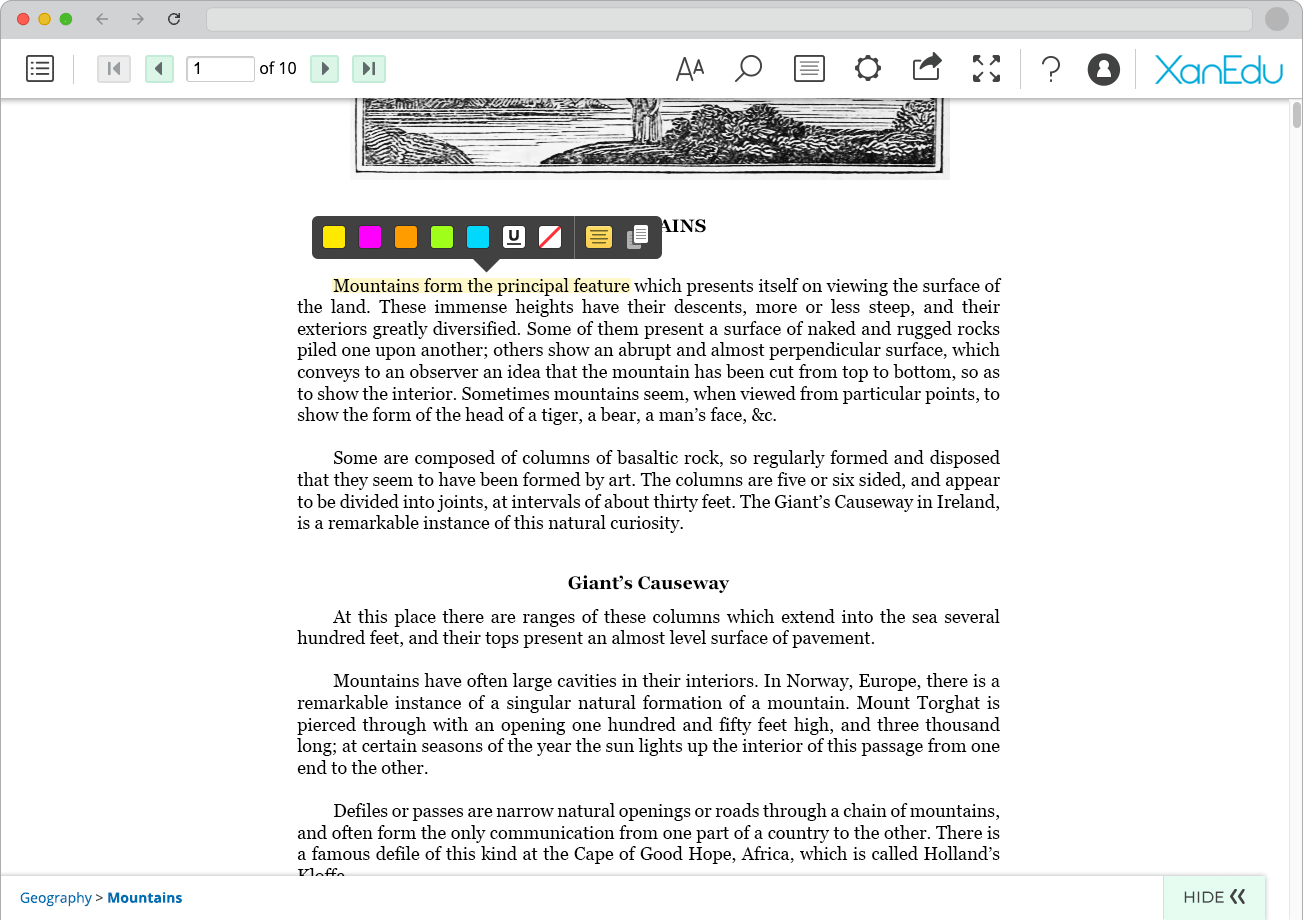
We followed a user-centric approach when redesigning both eReaders, prioritizing ease of reading and navigation. Previous iterations, user testing, and feedback revealed the challenges of consuming digital content, especially PDF-based content. For the K-12 audience, we simplified the experience—employing a minimal visual style, streamlining functionality, and adding supportive features like "Read Aloud," which lets young readers listen to content while words are highlighted on screen.
Wireframes
Our experienced team leveraged clear objectives and requirements to accelerate the eReader redesign process. We bypassed low-fidelity sketches, starting directly with high-fidelity wireframes that became UI mockups for stakeholder discussion and review. The resulting documents served as the basis for our development documentation in JIRA, creating an efficient workflow from design through implementation.
Prototypes
I built interactive prototypes from the high-fidelity mockups using HTML, CSS, and JavaScript. The prototypes supported collaboration and goal-alignment, while also allowing us to catch issues early and speed development through code reuse. The prototype’s code transferred directly to the application's front-end, and I ensured smooth handoffs by managing assets through code repositories or direct transfers as needed.
More Case Studies
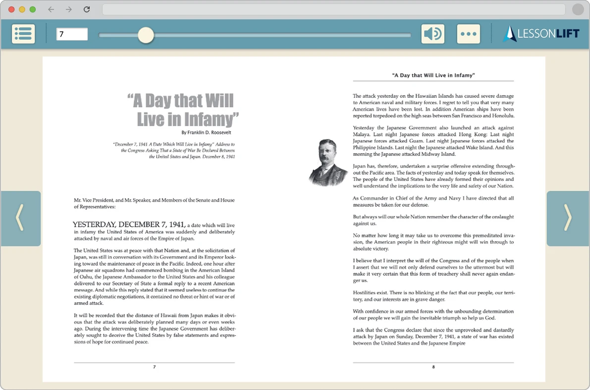
LessonLift | Product/UX Design: For a comprehensive take on an end-to-end product design project, dive into my LessonLift case study
NextLesson | Product Management & UX Design: For a vibrant K-12 interactive lesson platform view case study
Blog2Print | Product Management & UX Design: For a popular web-to-print platform view case study